About Us
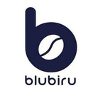
The letter "b" in Blubiru’s logo stems from its name. Originally, the logo concept featured a magnifying glass with coffee beans, but it was later simplified to the lowercase "b" to better represent the brand. The logo’s color reflects the essence of Blubiru, symbolizing calm, trust, and dependability.
To ensure consistent quality, we adhere to strict SOPs, conduct regular training and taste tests, and actively gather feedback from staff and customers. Initially, our slogan was "COFFEE. BAKERY. LOCAL DELICACY," but it was revised to "GOOD FOOD, GOOD COFFEE," which better reflects our mission to serve high-quality, delicious food and coffee.
The name Blubiru was chosen for its uniqueness and connection to the color blue, symbolizing calmness, relaxation, and trust. Inspired by blending the English word "blue" and the Malay word "biru," the name bridges global appeal and local culture, creating a brand that is both modern and authentic. The combination of these elements makes Blubiru distinctive, memorable, and appealing, especially to younger, trend-focused customers.
Additionally, the fusion of languages reflects creativity and innovation, positioning Blubiru not just as a cafe but as a space for collaboration, community, and connection.
